Thursday, February 25, 2010

Creating the Illusion of 3-Dimensional Space


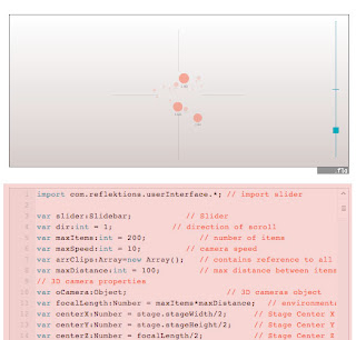
  1. Download Slider File at http://www.reflektions.com/miniml/template_permalink.asp?id=437 and save it into the folder that will hold your project.

  2. Create a new file in flash.

  3. Copy code from http://www.reflektions.com/miniml/template_permalink.asp?id=459 and paste it into the first frame of your new file.


  4. Test the File.

  5. When it doesn’t work… (next two steps can be repeated as often as necessary)


  6. Google it.

  7. Ask Dave how to fix it.

  8. When that fails…


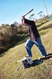
  9. Take Mac outside, find baseball bat, and smash.


  10. Bury remains

  11. Calmly walk back into the lab, and start over.


Please stay tuned for Part II, in which we will actually learn how to create the illusion of 3D space.

Friday, February 19, 2010

Who'd have thought...

Anyone who knows me knows that I am not a crafty person...not even a little bit. Those of you that knew me in my youth remember times of gummy bears, hot glue burns, and my VERY pink room. (in my defense, I didn't exactly choose that) Needless to say, this last project I have been working on is very outside my comfort zone.

For one of my business classes, we are designing a new site for a start up company that does vinyl lettering called off the wall. This week I had the exciting task of coming up with a logo for their company. Something "trendy and colorful". Now, I know that I just ooze with trendiness, but, surprisingly, this was a rather difficult task for me, and here is what I came up with.
Anyway, now that I'm about to post it, I can definitely see some room for improvement. For example, I think it needs more weight, because it is certainly not as crisp on the web as it looks in illustrator. Anyway, I'd love to hear your thoughts.

Tuesday, February 16, 2010

Presidents

I'm back. Here we go for another round. We have a new assignment called, "Make a website for your portfolio about anything you want." So, I decided to do a site on US presidents. Mostly because I don't know much about history (and would like to) and because it is different design-wise than anything I have ever done.

So, it's pretty much going to be awesome. I'm really excited. I want it to start with a 3D timeline that shows all the presidents terms along with major world events and possibly some major inventions as well. (only major one's, or this will be too big for me.) This will also serve as the main navigation. (I do run into a problem here, because I would have no idea how to make this timeline 3D.) Each president will have a small picture by his name, so that when clicked, it will take you to a bio about the president that will look something like this.


This also sort of demonstrates what the whole look/feel of my site so far. Obviously there is no text in there yet. I definitely need to work on the typography and decide how to put in all the stuff I want to. Currently, I'm thinking the quote at the top will change every 5 or 10 seconds or so (although I can't decide if that is a good place for the quote). Also I want to include stuff like a quick bio, interesting facts and personality quirks (you know, like the cherry tree), political party, how they died (i.e. in office, assassinated etc.) their religion, info about their spouses, quotes, and possibly a map of the US that shows where they are all from.

So, if you have suggestions about design, things that I should include in my site, ways to make a timeline 3D, or good resources I would love to hear from you.
Monday, February 15, 2010

LZR Racer

So, it is a new semester. I haven't written anything yet, but it's never too late to start.

I have realized that I am really bad at 3D space when it comes to design. Really, I'm not so hot at websites in general. Then you throw in this animation dynamic...it's bad. So, I would really welcome some feedback. That is the only way I will get better. And it will be nice to actually track my progress. I am planning on posting before my projects are due in the future.

However, this project is already past its due date. We basically had to pick something (simple) and make a site about it. Yes, I am a complete nerd and I did, in fact, do my site on a speedo. :) Hey, I'm a swimmer. What can I say? Fortunately, it's a cool suit and wins lots of records. :) Anyway, there was so much that I wanted to do with it, including:

  • A preloader, it's sort of slow, and if you click something before it's done loading, it gets all messed up.
  • Much more information to go through, possibly sub links to display some of it.
  • A way to magnify the suit to look at the specific materials
  • Stats about how much it increases speed, medals, etc.
  • I would also love the picture on the home page to spin so that you can see all the angles of the suit.
Anyway, I would love some feedback on it. I will be taking a portfolio class in the fall, so will still be able to implement changes. Thanks!!

As a side note before you click, it does not at this time have a preloader, therefore give it a bit before you start clicking on buttons. You know, read the info or something. Otherwise, it will be a mess. Thanks.

flash website preview

Monday, December 7, 2009

And then, on to a flash website. I found this much easier than the animation for some reason. This is an artist by the name of Kurt Wenner. I was first introduced to his stuff via e-mail...one of those e-mails that seems completely phony. I thought for sure they were photoshopped, but on further investigation, discovered the amazing world of Kurt Wenner. So, when it came time to do a site, I decided to do a portfolio of his work. You can view my site here!

But wait, there's more.

Alright, onto my animation assignment. This assignment was a little bit..."special" for me. I was, and still am, super busy, and super bad at animation. It started out rocky with a hurried design with the poster, and went downhill from there. And, for those avid fans of Disney's UP, they may notice that it is a 90 second clip cut down to 30 seconds. Wow. So, okay. Here are some drafts of the poster.


Draft 1
Designed in Black, White and Red because I didn't know what colors I wanted to use yet.


Draft 2
I picked some colors...


Draft 3
Changed the colors and changed the design

That said, Here's UP! Just kidding. I can't quite figure out how to upload a flash video here, so once again, look at my class site to see the animation.

It's the end of the world as we know it...

I have not kept up on my blogging, to be honest. So, in hindsight, I will post the projects I have done. The first project was an html website. It can be found on my course website, which will be non-existent in a month, or, you can look at a version in a more permanent spot. However, you should be forewarned that I have not updated it on my permanent site. I suppose that is a relatively good thing, because that means that you can see at least some progress! (which was the initial intent of this blog anyhow.) In light of that, you can also check out the real Solar Roadways site, which, I might add, has just been redone! Here is the site that I was working from, in case anyone is interested. As you can see, they have greatly improved!